
.png)
Initiative to strenghten the product page for the best full experience that works equally well for everyone.
Fyndiq is an e-commerce marketplace that sells everything from toys to mobile accessories. Over time, the Product page saw an opportunity to strengthen the experience, motivated by my presentation of UX/UI issues, aligning with Fyndiq's focus to strengthen the core business.
The goal was to improve the experience of the product detail page; while re-using as much of the same components on all types of screens, to quickly be ready to devolp and launch new page.This project spanned around 2-3 weeks from conceptualization to prototype development.
The Team
Me
Ux Designer
Lizbeth Guerrero
Product designer
Alvaro Garrido
Senior UX designer
A more helpful, more intuative way to shop on all screens
The Product detail page in Fyndiq mobile, specifically on desktop screens, was a primary and disjointed experience. How might we make the PDP easier to interact with, balancing open and hidden information making it easier for people to find wanted details, which may lead to an opportunity of purchase.
Breakdown of problem
Though pre-research such as conducting a heuristic analysis applying existing user personas and collecting user behaviors using Hotjar. We could identify the key user needs and prioritized them for fyndiq's primary user base.
🔓 Breaks when scaled to larger screens
The product page did adapt information on desktops screens; information had no prioritization making it difficult for users to find their desired information.
☎️ Dated Usability
Dated usability details such as unclear feedback at users actions and not being able to zoom in on pictures.
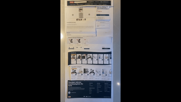
OVERVIEW OF OLD EXPERIENCE

☝️Disjointed experience
Improving the accessibility and relevance of desired information, essential help users in making well-informed decisions
Conceptualizing our ideas
Based on the research gathered we defined a sitemap of existing components and started discussing our ideas. Most of Fyndiq’s users view the site on mobile. Therefore, we prioritized the design of the mobile view. Designing mobile-first, then working on desktop view.

.png)
Prototyping
After creating a rough sketch of the initial design during the sitemap construction, we took our ideas and finalized it in Figma. We created paper prototypes to illustrate the interaction flow in various scenarios, making it effortless to present and communicate the concept to the development team.
Outcome of Re-design
Each highlight captures an aspect of the new product detail page experience. It calls out what user scenario or problem it's solving and what the solution is.

Smaller product pictures and thumbnails
52% of users are entering the product page directly through an ad, which means that they do not see the summary of the product in the product lists.
By reducing the size product picture smaller visitors can see product name, price and a the buy button on most phones instantly without scrolling. Smaller product thumbnails puts focus on product picture users are seeing, the thumbnails are only used to hint that there are more pictures.
Accessible customer reviews + product description
Showing a maximum of 3 customer reviews and a preview of the product description makes the information more accessible and visible to users.
The information is essential to highlight as they are new, users already know the price and product name before entering the product page.


Intuative visual hierarchy of product information
When users are on a shopping journey, they commonly judge the product based on price, name, rating and picture before clicking into a product page.
Prioritizing Product name in context to picture then colors/size choices and lastly, price details and star rating.
Resposinve and improved layout on desktop screens
Before, the desktop view of the PDP contained an overwhelming amount of information, and the layout caused this. In the redesign, we focused on creating a focused layout that is easier for the eyes.
By creating a two-column grid that separates information and makes the buy button always avaible. never losing context.
